
Paying homage to nature, craftsmanship, and history.


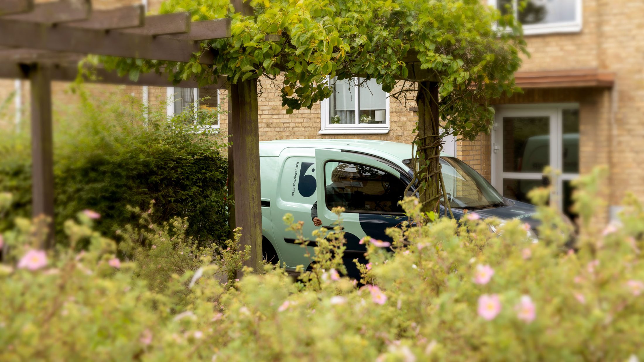
Bjuvsfastigheter is the municipal property company that develops both homes and community properties in Bjuv, Billesholm and Ekeby with care, responsibility and a long-term perspective. With sustainability and safety in focus, they create homes and environments where people feel comfortable and want to stay.
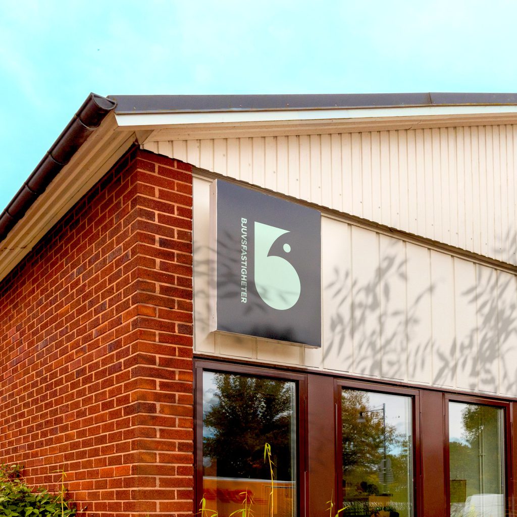
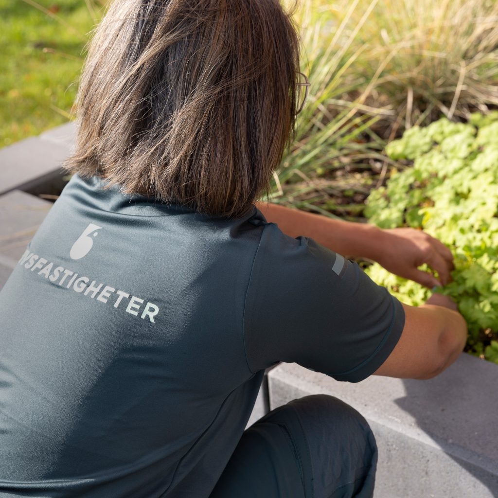
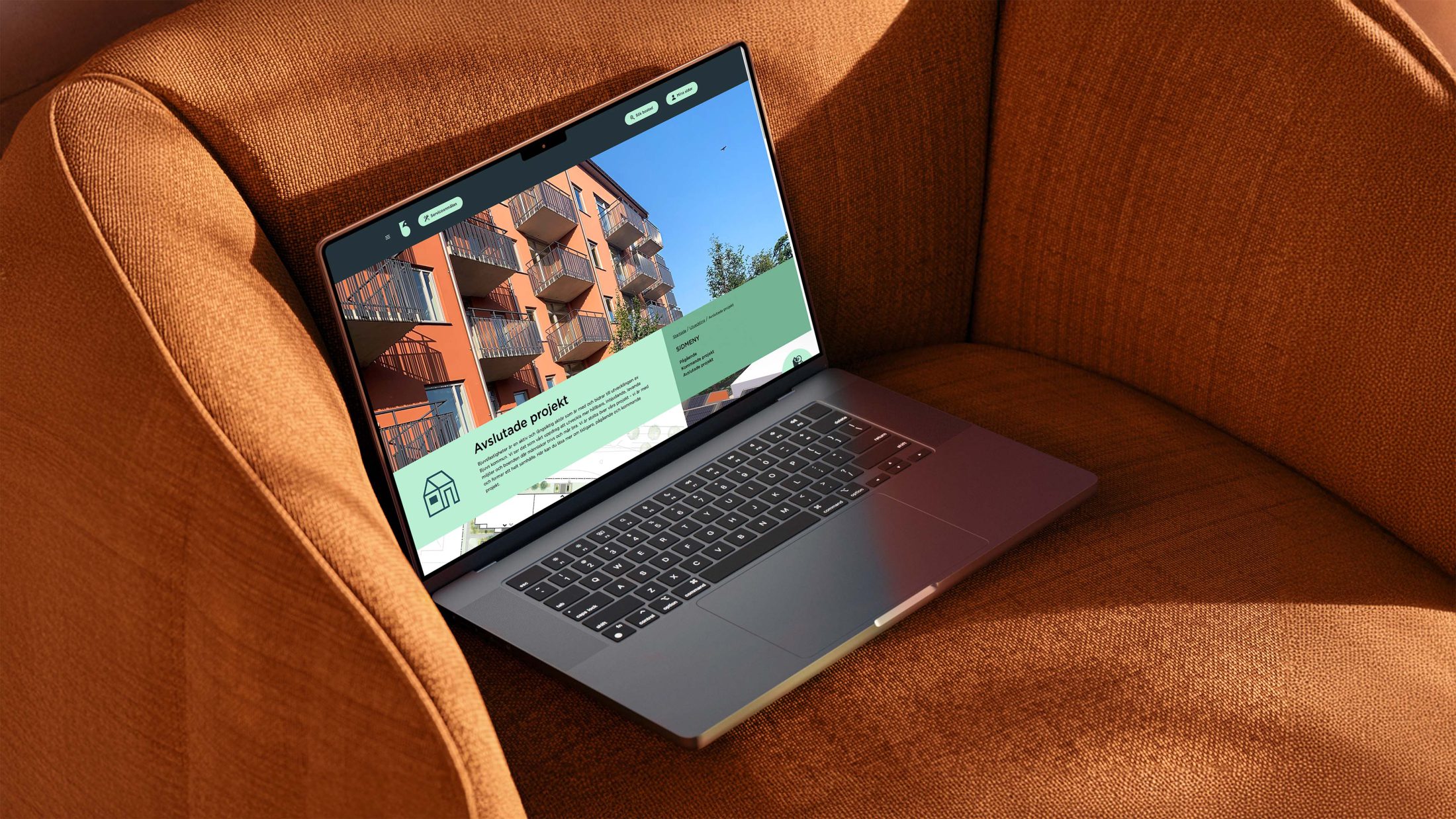
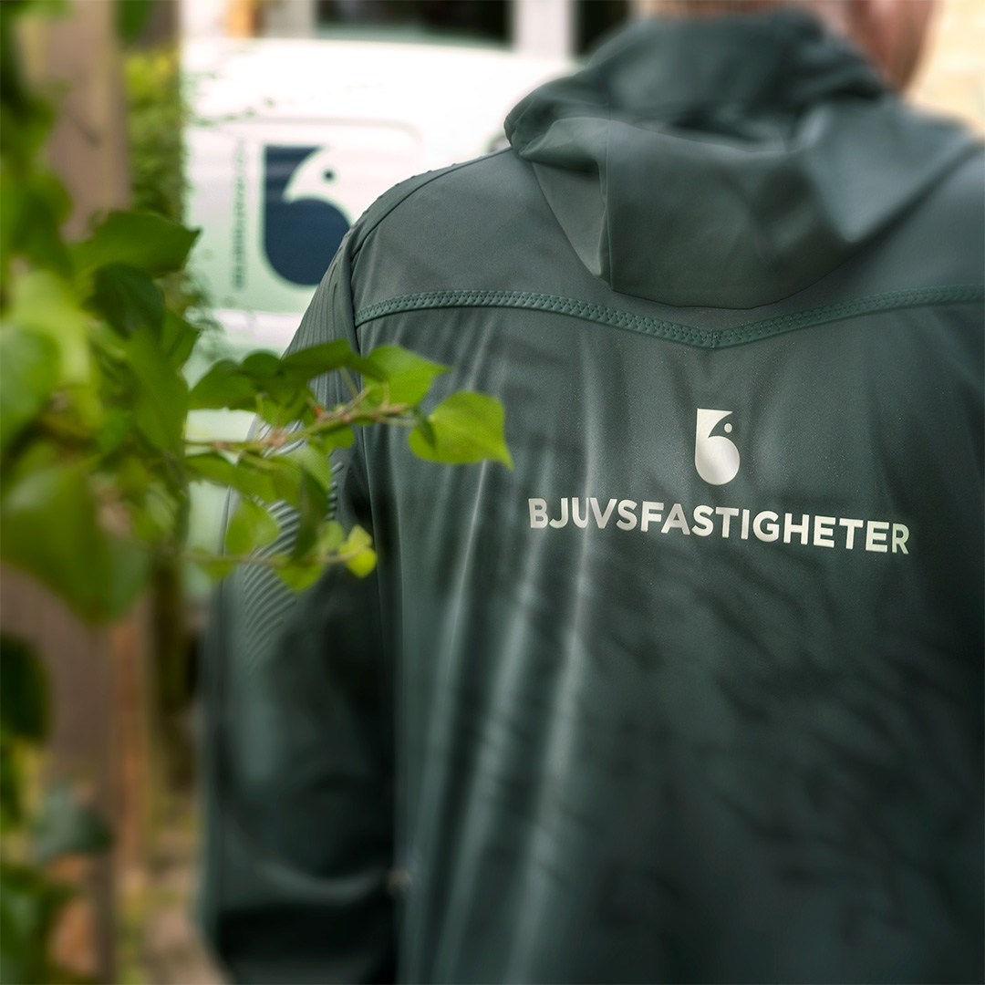
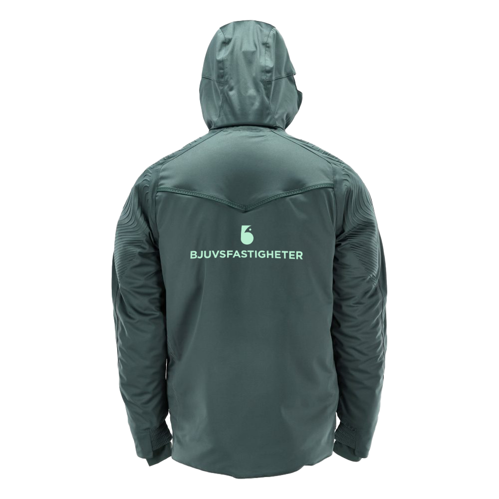
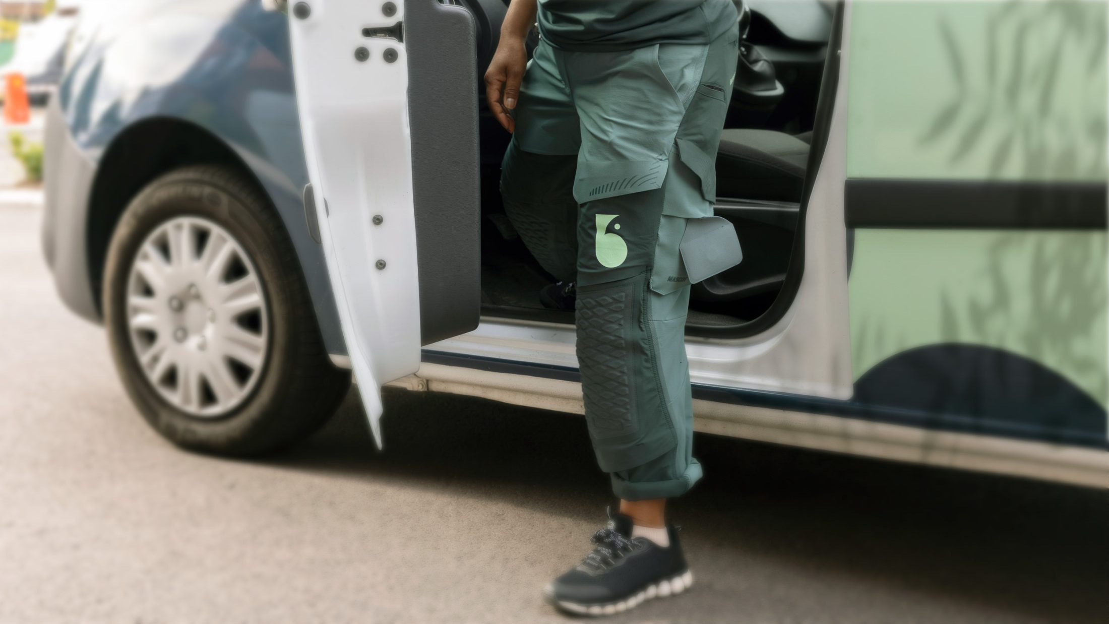
We were commissioned to develop a brand identity that reflects their strong local roots and future focus. The logo consists of both the letter B and a stylized bird – a symbol for building your nest. The color palette is deeply rooted in Bjuv and celebrates nature, craftsmanship and history.
The result is a modern and warm identity that carries the company safely into the future